QUICK VERDICT. Most tools treat an infographic as a picture. Visme infographics are closer to a small web page: you can pull numbers straight from Google Sheets or Excel and keep the charts synced as the data changes, add hover effects and pop-ups, publish it as a live URL or embed it in your site, then watch the view analytics. With 50+ charts, widgets and maps behind it, this is the strongest infographic builder in the category for anyone whose graphics contain real data.
Visme positions the tool around data rather than decoration. Screenshot: visme.co
The feature that changes the workflow: live data
This is the single biggest reason to pick Visme for infographics. You can import data from Google Sheets or Excel, and the visuals stay synced as the numbers change.
Think about what that removes. The normal infographic lifecycle is: pull the numbers, build the chart, export the image, publish it — and then watch it go stale the moment the figures move, at which point somebody has to rebuild and re-export the whole thing. With a linked sheet, you update the source and the published graphic follows.
For a monthly KPI graphic, a live fundraising tracker, or a report that gets refreshed each quarter, that is the difference between a one-off asset and something that maintains itself.
50+ charts, widgets and maps
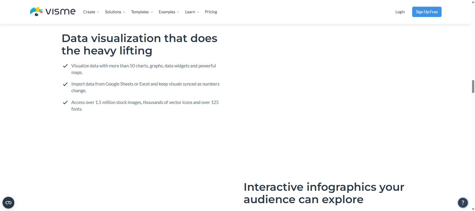
Visme gives you more than 50 charts, graphs, data widgets and maps to build with. The widget part matters as much as the chart part — these are the radial gauges, progress bars, pictograms and stat callouts that carry most of the actual information in a good infographic, and they are usually where lightweight design tools run out.
Fifty-plus visualisation types, live spreadsheet import, and 1.5 million stock images behind them. Screenshot: visme.co
The chart range goes well past the basics too. Alongside bar, line and pie there are gauge, area, funnel and Mekko charts — the kind of thing that normally lives in consulting software rather than a browser design tool.
Around that sits the asset library: over 1.5 million stock images, thousands of vector icons and more than 125 fonts, so you are not sourcing artwork separately. You can see the full toolset on the Visme infographic maker page.
Interactive infographics, not just images
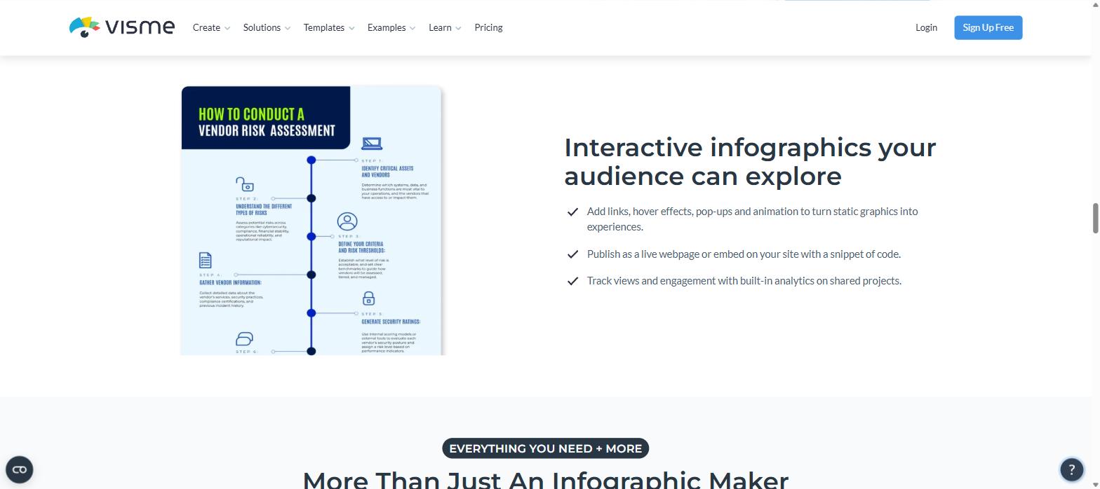
A Visme infographic does not have to end as a flat file. You can:
Add links, hover effects, pop-ups and animation
Publish it as a live webpage or embed it on your site with a snippet of code
Track views and engagement with built-in analytics on shared projects
Hover states, pop-ups, embeddable live pages and view tracking on shared projects. Screenshot: visme.co
That combination is genuinely rare. It means a long, dense infographic can hide its detail behind hover states instead of cramming everything on screen, and it means you can tell whether anyone actually looked at it — a question most infographics never get to answer.
Templates that start you at the right structure
The infographic library is over 1,000 templates on its own, organised by the shape of the story rather than by decoration: Statistical, Informational, Timeline, Process, Comparison, Location, Hierarchical, How To, Anatomical, Resume, Mind Maps, Roadmaps, Nonprofits, Bite Sized, Flowcharts, Diagrams and Compare and Contrast.
Visme also groups the types into four families — Structural, Informational, Data Driven and Dynamic — which is a useful way to choose: pick the family that matches what your content is doing, then pick the layout.
You can also mix and match content blocks across templates, so a timeline section from one design can sit above a comparison section from another. Our full guide to Visme templates covers the wider library.
The four-step workflow
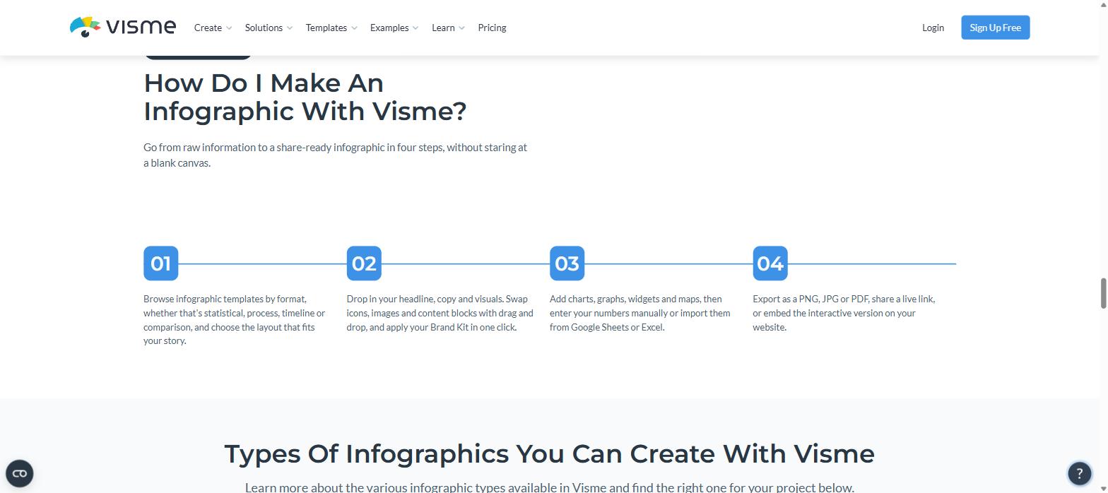
Visme describes the process in four steps, and in practice that is how it runs:
Browse templates by format — statistical, process, timeline or comparison — and pick the layout that fits your story
Drop in your headline, copy and visuals, swapping icons, images and content blocks by drag and drop, then apply your Brand Kit in one click
Add charts, graphs, widgets and maps, entering numbers manually or importing them from Google Sheets or Excel
Export as PNG, JPG or PDF, share a live link, or embed the interactive version
Template, content, data, then export or embed. Screenshot: visme.co
Visme claims this improves design speed by up to 70%. Treat that as marketing, but the underlying point is sound: starting from a structured template with working data widgets removes most of the blank-canvas time.
Which infographic type to reach for
Visme groups its infographic types into four families, and picking the right one first saves more time than any design decision that follows:
Structural — hierarchical charts, flowcharts, mind maps and diagrams. Use when the point is how things relate to each other.
Informational — how-to, anatomical and bite-sized layouts. Use when you are explaining something rather than proving it.
Data Driven — statistical and comparison layouts built around charts. Use when the numbers are the argument.
Dynamic — timelines, processes and roadmaps. Use when the content moves through time or stages.
A common mistake is building a data-driven story on an informational layout, then trying to wedge charts into space that was designed for illustration. Choosing the family first avoids that entirely, and it is why the Visme infographic templates are sorted this way rather than by colour or theme.
Brand control and scale
For teams, the Brand Kit locks colours, fonts and logo so every infographic ships on-brand without anybody policing it, and privacy controls include password protection and encryption on shared projects.
Visme says it is trusted by 35M+ users, and it holds 4.5/5 from 719 reviews on Capterra with 92% positive sentiment — strong numbers for a tool this specialised. You can start on the Visme infographic builder without a card.
What to know before you start
Two practical notes, so you pick the right plan.
The features that make infographics powerful are mostly paid. Live analytics, Brand Kit and privacy controls sit on Pro ($59/month, or $24.75 billed annually). More fundamentally, the free Basic plan cannot download in any format at all, and its charts and data widgets are marked “limited” — so free is for building and sharing by link, not for producing files. Our Visme free plan breakdown sets out exactly where that line falls.
Fine-tuning takes patience. In the same Capterra data that gives Visme 4.5/5, the recurring complaints are about the editor rather than the output: cumbersome text editing and awkward object resizing. On a dense infographic with a lot of small elements, that is where you will feel it.
Verdict
For infographics specifically, Visme is doing something its competitors are not. The template structure is better organised, the widget library is deeper, and the live-data and interactive-embed features turn an infographic from a disposable image into an asset that updates itself and reports back on its own performance. If your graphics carry numbers, it is worth the learning curve.
The iPhone 18 no ports theory is suddenly everywhere. A video making the rounds on TikTok and social media appears to show something startling: an iPhone — labeled as the “iPhone 18” — charging through a small magnetic connector instead…
Hottest fashion trends 2026 reviewed honestly — which trending styles are actually wearable, which are overhyped, and what’s worth buying right now in the US market. Quick Verdict: 2026’s biggest fashion trends fall into two camps: genuinely wearable evolutions of…
PS5 Pro review 2026 — I tested it for 30 days. Here’s the honest verdict on performance, graphics, and whether upgrading from a standard PS5 is actually worth the money. Quick Verdict: The PS5 Pro is the most capable PlayStation…